Pax Romana at Dusit Dubai. An excellent, stylish restaurant. Decor, furnishings, food, staff, views, all are excellent.
The menu though! Designed by someone with no thought about its use or users. And obviously approved and accepted by the management.
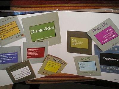
A cumbersome heavy thing, like a child's first book, printed on very thick card. But worse than that, it's not a menu, a bill of fare, it's an abstract design project. The sort of thing you get from first year design students.
Design for the sake of it. Bits and pieces all over the place. Sideways and upside down even.
Think I'm exaggerating? Here's a photo of a page:


3 comments:
That's awful!!!!
i guess its not the first year design students but its the difference between the student whose education is passion and the one whose education is fashion
Seabee: it is new, because I was there in July and they still had the 'normal' style menus. What on earth were they thinking, what an assualt on the eyeballs!
HMHB
Post a Comment